A SOLV’D CASE STUDY
Two Properties | Two Outcomes | One Consistent Insight
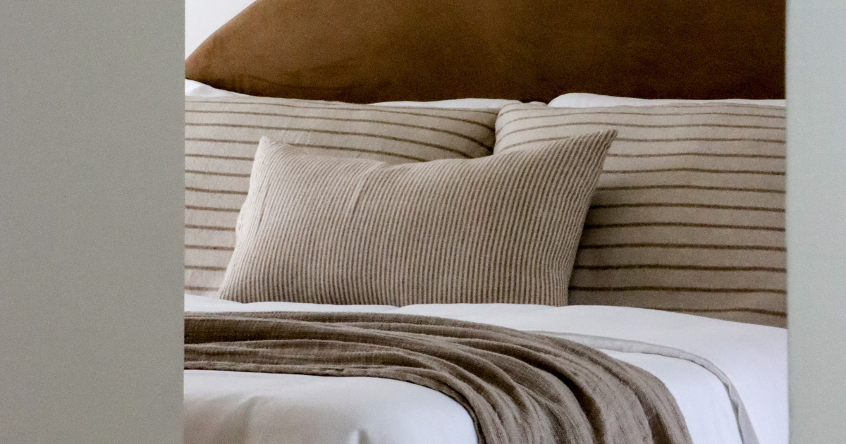
In Brisbane’s evolving luxury market, the quality of a property presentation doesn’t just change how a home looks, it changes how buyers feel, how fast they decide, and ultimately, what they pay. Premium furniture staging transforms high-end properties into aspirational lifestyle showcases, directly accelerating sales by helping sophisticated buyers emotionally connect with the space.
These two recent luxury sales outcomes exemplify exactly that.
")
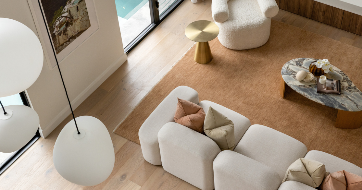
PROPERTY 01
Bardon – Architecture Meets Aspiration
Listed 6 April 2026, this architecturally complex Bardon home went to auction on 2 May and sold 11 May, achieving a 26–30 day campaign window that outperformed the suburb’s median days on market of 37 days, in a suburb experiencing – 3.2% price growth.
ACHIEVED PRICE BAND
$5.8M
Est. Range $3.8M – $4.8M
SUBURB MEDIAN DOM
37 days
Campaign DOM 26-30 days
MARKET CONDITIONS
-3.2%
Softening Growth Trend
This home, the builder’s debut residential project, and the nation’s most viewed property on realestate.com.au in the lead-up to auction, brought with it a wave of national interest that few listings ever achieve. Premium staging played a central role in translating the home’s architectural complexity into an experience buyers could immediately connect with.
In prestige markets, staging operates less as decoration and more as a value translation layer between architecture and buyer psychology. By creating instant spatial understanding and elevating perceived finish quality, the presentation anchored emotional decision-making before auction day, reducing the uncertainty premium buyers typically apply at this price point.
What premium furniture staging delivered:
- Immediate spatial comprehension of an architectural floorplan
- Elevated perceived value from a $3.8M–4.8M estimate into the $5.8M achieved band
- Reduced perceived risk for buyers at a high price point in a softening market
- Competitive bidding confidence through reduced buyer uncertainty
")
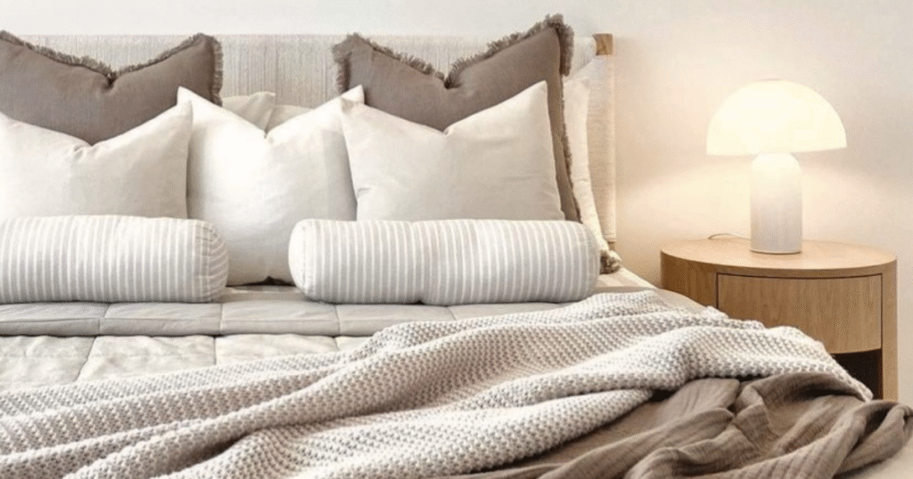
PROPERTY 02
Coorparoo – Speed Compression in Action
Listed early May 2026, this Coorparoo property reportedly sold in 5 days, dramatically outperforming the suburb’s standard 20–35 day cycle, even against high-performing styled homes, which benchmark at 10–15 days. The suburb is experiencing +7.4% growth driven by family upgrader demand and the supply of renovated character, hybrid stock.
DAYS ON MARKET
5 days
Benchmark 20-35 days
ACHIEVED PRICE BAND
$4M
Suburb Median $1.5M-$2M
MARKET CONDITIONS
+7.4%
Strong Growth Corridor
The results in Coorparoo illustrate the property styling wasn’t primarily about luxury signaling, but also generating compression in buyer decision time. The “move-in readiness illusion” created by premium furniture staging meant buyers left the first inspection with an emotional verdict already formed.
Strong presentation removed the need for second inspections, a critical factor in a result this fast. When a buyer can immediately project themselves into a finished, beautifully curated space, hesitation cycles collapse. The outcome shifted from a typical 20–30 day market cycle to what was, effectively, an off-market speed exit.
What premium furniture staging delivered:
- “This feels finished” perception from the very first inspection
- Reduced buyer hesitation cycles, critical in achieving a 5-day result
- Eliminated need for second inspections in most cases
- Accelerated absorption in an already high-demand inner-east suburb
")
The Consistent Thread
Across both properties, premium furniture hire and expert styling operated as a conversion tool between property potential and buyer certainty. Whether the goal was price maximisation or rapid sale, the mechanism was the same. Premium furniture staging gave buyers what they most needed, the emotional experience of already being home.
For sellers in Brisbane’s luxury market, the data from these two campaigns makes a compelling case: premium staging is not a cost, it is a strategy.
Supporting Exceptional Property Outcomes in Greater Brisbane
Setting the tone for Prestige? Whether your goal is highlighting architectural nuance, showcasing aspirational lifestyle, or that digital listing “wow” factor, premium staging justifies your multimillion-dollar price point.
If you’re preparing a luxury property for market, premium furniture staging from a trusted partner, is key to achieving exceptional outcomes…
Frequently Asked Questions About Commercial Furniture Hire
Who typically uses furniture hire services?
Furniture hire is commonly used by property stylists, real estate agents, developers, photographers, production companies, event organisers and property investors.
Is furniture hire only for home staging?
No. While home staging is one of the most common uses, furniture hire is also used for film production, marketing shoots, rental properties and events.
Is hiring furniture cheaper than buying it?
For short-term use, hiring furniture is usually far more cost-effective than purchasing it, especially when transport, storage and styling changes are considered.
Where is furniture hire most common in Queensland?
Furniture hire is widely used across Brisbane, Gold Coast, Sunshine Coast and Toowoomba, particularly in property marketing and creative industries.
Commercial furniture hire plays a much larger role than many people realise.
From home staging and property marketing to film production and corporate events, the ability to quickly access curated furniture allows businesses to create environments that feel complete, professional and intentional.
Whether the goal is selling a home, marketing a product or creating a compelling visual environment, furniture remains one of the most powerful tools for shaping how people experience a space.
Related Reading
For a deeper understanding of how presentation influences buyer behaviour, read:
The Complete Guide to Home Staging That Actually Sells Home
This guide explains how staging, furniture, and layout influence buyer perception and sales outcomes.
")


")
")
")
")